Storefront graphics are often the first point of visual contact between your business and your potential customers. From choosing the right type of sign to some proofreading tips, here’s an essential checklist to create the perfect storefront graphic.
A Checklist to Create the Perfect Storefront Graphic
1. Know Your Local Storefront Sign Requirements.
Depending on your city or the area where you live, your storefront graphics may need to adhere to certain regulations. Learn more about these requirements and design your graphics with those guidelines in mind—You don’t want to waste time working on a sign you won’t be able to display!
2. Work With a Knowledgeable Designer
Your storefront sign will be only as good as the designer you choose. A large format printing company with extensive experience should have a team of designers able to understand your needs and help you make the right decisions to achieve your communication goals.
A knowledgeable designer can offer advice on every aspect of your storefront graphics, from the materials to use to the type of sign that works for you (more on that in just a moment).
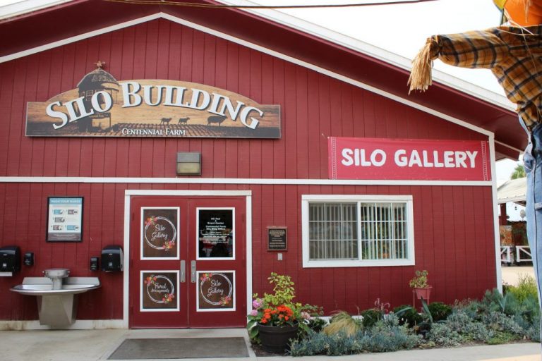
3. Choose the Right Type of Sign.
Your business needs a sign that reflects your brand’s personality and fits the surface you have available. For example, if your storefront is made of glass for the most part, using window graphics is a clever way to make a big visual splash.
Digital printing has significantly expanded the horizon of sign alternatives you can choose from. Some of the options at your disposal include:
- Window graphics
- Wall graphics
- Vinyl banners
- Pole signs
- Pylon signs
4. Make Sure Your Storefront Graphic Is Visible.
It’s plain common sense: you want your customers to be able to see your storefront graphics. While this may appear obvious, ensuring visibility is not as easy as it sounds.
Take a look at the area where you plan to place your sign. Is it visually cluttered? With what other elements will your sing be competing for the attention of passersby? Are there any objects nearby that may block the view? Share all these thoughts with the person designing your storefront graphics.
5. Make Sure Your Graphic Is Easy to Read.
After ensuring that people are able to see your sign, you should also take steps to make your sign easy to read.
Here, two factors come into play: typeface and contrast.
Simply put, a typeface is the type of letter you choose for your sign. Verdana, Calibri, and Helvetica are some examples of popular typefaces. While some people think that a complex typeface makes an impression, the truth is that you want your typeface to be as simple and easy to read as possible.
Contrast, on the other hand, refers to the interaction between the colors of the elements of your sign. As a general rule, the safest choice is to go for dark letters (black, blue, green, or red) on a light background (white or yellow).
6. Include All The Necessary Information.
Take time to go over your design and determine the elements you would like to display. Some information that your customers may find useful include:
- Logo
- Slogan
- Telephone
- Website
- Business hours
A word of caution, though: while providing as much information as possible is a good idea, you should avoid overcrowding your storefront graphic. Your designer can help you find the right balance between valuable information and visual tidiness
7. Proofread Your Graphic.
When it comes to signs, few things are worse than a typo on your storefront graphic.
The wrong letter at the wrong place projects an unprofessional image that can do more harm than good for your business.
Luckily, there are some simple ways to prevent this problem:
- Ask another person to read your sign. Over time, you will become too familiar with your sign. This familiarity can prevent you from catching typos that are obvious to someone who sees your graphic for the first time.
- Read your sign backward. Another way to fight excessive familiarity with your sign is to read the text backward. This way you are forced to go over every word at a slower pace than usual, allowing you to detect any mistakes or inconsistencies more easily.
CR&A Custom: High-Quality Storefront Graphics
Interested in using storefront graphics to promote your business? CR&A Custom is here to help.
We are a Los Angeles-based large format printing company proudly serving customers of all types and sizes in the United States and abroad.
Contact us today by email (info@cracustom.com), telephone (213-749-4440), or social media (Facebook, Instagram, or LinkedIn) for a free estimate or to learn more about our full range of large format printing solutions: building wraps, wall graphics, window graphics, vehicle wraps, boat wraps, and more.
By CR&A Custom Inc August 10, 2021