When you walk into a store, event space, or office, one of the first things you see is a sign. If it's clear and easy to read, it makes navigation simpler for everyone. For people with disabilities, that clarity can make all the difference.
That's why the Americans with Disabilities Act (ADA) sets strict but essential standards for signage to ensure equal access, independence, and dignity.
The ADA covers the details that matter: readable fonts, tactile elements, high contrast, and proper placement. These design choices allow millions of people to move with ease through public spaces every day.
With updated ADA guidelines in 2025 and a growing focus on inclusive design, staying informed is more important than ever. Here's a quick guide to the latest rules, smart design tips, and how to keep your signage both compliant and visually on point.

What is ADA Compliance?
Under the ADA (Americans with Disabilities Act), people with disabilities must have equal rights and access to public spaces, jobs, and services.
In public spaces, ADA compliance focuses on these key areas:
Signage must include braille, raised characters, and clear labels for the following: restrooms, exits, and room names. If a restroom or elevator isn't accessible, a sign showing where to find one must be present.
Entrances must be wide enough for wheelchairs and easy to open. Revolving doors don't count. In many cases, power-assisted or automatic doors are required.
Restrooms need to be easy to use for people with mobility issues through features like grab bars, lower sinks, and enough space to move around.
Wayfinding means creating clear paths that everyone can follow, from the parking lot to the front desk to every main area inside.
Failing to follow ADA guidelines risks legal consequences—and, more importantly, everyday challenges for people with disabilities. Accessibility is more than a requirement but a commitment to inclusion and respect for everyone.
Such a commitment matters more than ever. According to the CDC, over 70 million Americans had a disability in 2022. That includes physical, sensory, mental, or long-term conditions like those resulting from COVID-19. Making your space accessible is about ensuring everyone belongs.

Essential ADA Signage Requirements
If you're updating or installing signs in commercial spaces this year, follow these ADA accessibility guidelines.
Font size and style
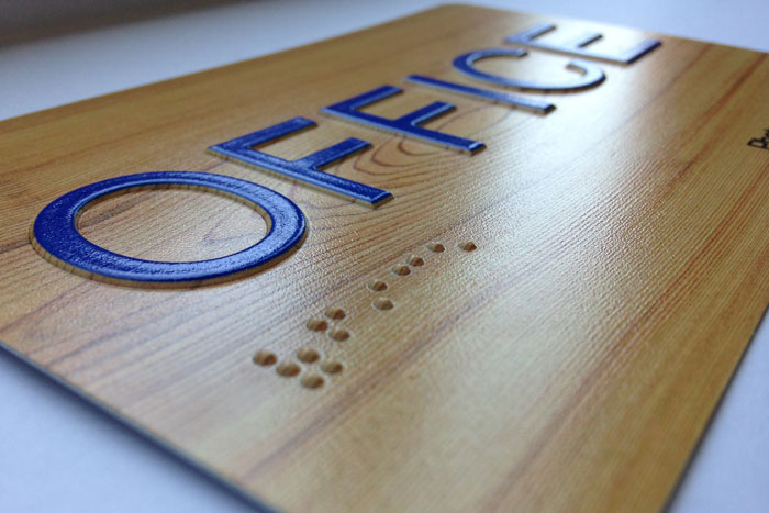
For tactile signs, which include raised characters and braille, use all capital letters in sans serif fonts. Fancy styles like script or italics aren't allowed. The letters should be between ½ inch and 2 inches tall. If the same letters are meant to be read visually, they need to be at least ⅝ inches tall.
For visual-only signs, which rely solely on text and symbols for readability, you can use uppercase, lowercase, or both. The size depends on how far away and how high the sign is, but usually, letters should be at least ⅝ inch tall.
They need to have good contrast but not shiny, so they're easy to read. Letters and lines should have enough space around them.
Braille placement and formatting
Braille must be on all tactile signs, like room numbers, elevator buttons, and exit doors. It always goes below the raised text and must have at least ⅜ inch of space from any letters, borders, or designs.
Here's what else you need to keep in mind:
Braille must be at least ⅜ inch below the raised text or any nearby borders/designs.
It must be placed in a horizontal line, not stacked vertically.
Braille dots must be rounded, not flat or sharp.
The entire sign with braille must be mounted so the lowest tactile character is at least 48 inches and the highest is no more than 60 inches from the floor.
Only proper nouns, acronyms, or the first word of a sentence use braille capitalization.
Provide at least 18 x 18 inches of clear space in front of the sign so people can read it by touch without anything in the way.
At doors, place signs on the latch side whenever possible—if there's no space, use the adjacent wall.
Sign mounting heights
Put tactile signs where people can easily reach and read them. The raised characters should be between 48 inches and 60 inches from the floor. Visual signs, like directional or informational ones, should be at least 40 inches high.
If you're placing a sign in a parking area for people with disabilities, the bottom of that sign needs to be at least 60 inches from the ground. Overhead sign clearance must be at least 80 inches above the floor so people can walk under it safely.
Meanwhile, a sign on a post shouldn't stick out more than 12 inches into walkways if it's between 27 inches and 80 inches off the ground.
Pictogram requirements
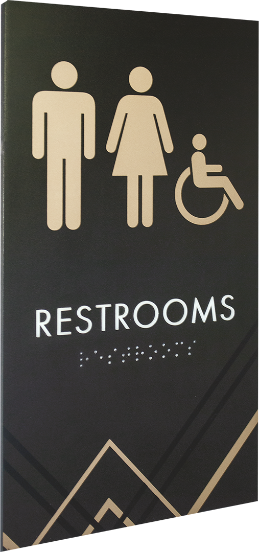
If you use pictograms for permanent rooms like restrooms or stairways, the symbol needs to be on a background at least 6 inches tall. Below it, you must have raised text and braille. The symbol itself doesn't have to be raised, but the sign should have good contrast and a non-glare finish, like white on black or black on white.
For signs with simple information or directions, including accessibility symbols like the wheelchair icon, you don't need to raise text or a 6-inch background. However, these symbols still need good contrast and a non-glare finish.
Accessibility symbols must follow the international standard unless you can demonstrate that an alternative design offers equivalent access. They don't have specific size or color rules. Written text is optional, but it must be easy to read.
Surface finish and contrast
The ADA doesn't require signs to be reflective like road signs. Instead, signs must have a non-glare finish. This rule applies to raised characters, their backgrounds, visual characters, pictograms, and accessibility symbols.
A non-glare finish lets people with low vision read signs more easily by preventing bright reflections. Braille is the only exception—it doesn't need a non-glare finish. Avoid textured or patterned backgrounds that make reading harder.

5 Industries That Must Prioritize ADA Compliance
Not every industry feels the same urgency to put up ADA-compliant signs, but in these five sectors, accessibility is a critical part of serving the public.
1. Retail
Retail stores welcome all kinds of people every day—including those with disabilities—so having ADA-compliant signs is part of good customer service. These signs allow people to find restrooms, fitting rooms, exits, and other key areas without needing to ask for help.
2. Hospitality
Hotels, resorts, and restaurants need welcoming and legible signage, especially for guests with visual or mobility challenges.
For example, a braille room number sign or a raised-letter sign pointing to the lobby lets guests with vision impairments move around confidently. Clear, readable signs also improve the experience for older guests and international travelers.
3. Healthcare
Accessibility directly impacts patient care. Clear, readable, and tactile signs assist patients with different disabilities find exam rooms, restrooms, emergency exits, or check-in areas without confusion or delay.
When patients can move through your facility with ease, you reduce stress, improve their experience, and show that you take equal access seriously.
4. Education
Accessible learning starts with a space where all students can move, understand, and participate easily—and that includes proper ADA signage.
With these signs, everyone can find their way, use school spaces, and feel included. Braille is useful for blind students, while clear, high-contrast signs support kids with learning differences or language barriers.
5. Commercial office spaces
A clean, professional, and welcoming office matters. But without ADA-compliant signs, you're missing a key piece of accessibility and putting your business at risk.
ADA signs help everyone—clients, visitors, and employees—find their way safely and independently. They also offer these other benefits:
They keep you out of legal trouble. Non-compliance can cost you up to $75,000 in fines, even more for repeat violations.
They also apply to employee areas. Staff break rooms and restrooms must be accessible, not just public-facing areas.
They show you care. Inclusive design makes your building more professional and demonstrates respect for everyone who walks through the door.
What Could Be Next? Future ADA Design Trends
ADA compliance isn't a trend you can simply hop on. It's a long-term responsibility that shapes how you create inclusive environments. Hence, it's essential to stay updated with the latest developments, such as:
Augmented reality (AR) wayfinding
AR wayfinding is the future of ADA signs because it gives real-time, personalized help that static signs can't. People with disabilities can get audio directions, vibration cues, or graphic overlays on their phones to navigate complex spaces with less stress.
It also supports those with learning differences by keeping instructions clear and straightforward.
AI-assisted kiosks
Beyond fixed signs, AI-assisted kiosks will respond to voice commands, provide audio directions, and adjust visuals for users with different needs. They'll make navigation and information access hands-free and intuitive, especially for people with mobility or visual impairments.
Expanded neurodiversity design standards
Future signs will focus on how people think and feel, not just how they move. Expect ADA compliance guidelines to cover calming colors, simple layouts, and easy-to-read text. These changes will enable people with ADHD, dyslexia, or sensory issues to feel more at ease and find their way faster.
Eco-friendly materials
More people and businesses today are putting sustainability front and center—and that includes how they approach ADA signage. That's why future ADA signs will use eco-friendly materials like recycled metal, sustainable wood, or low-pollution paint.
Sign makers are also finding cleaner ways to produce them, cutting down on waste and harmful emissions.
Good Design Includes Everyone—and That Starts with Signage
ADA-compliant signs are essential for creating inclusive, welcoming spaces. Whether you run a retail store or office, proper signage helps everyone move independently and feel safe. And as trends move toward smarter, more personalized solutions, having accessible signage is a priority.
That's where CR&A Custom comes in. As a leading large format printing services company, we specialize in ADA-compliant signs that are functional and visually striking. From concept to installation, we handle everything for you.
Contact us today to ensure your signage is ADA-compliant and design-forward.


