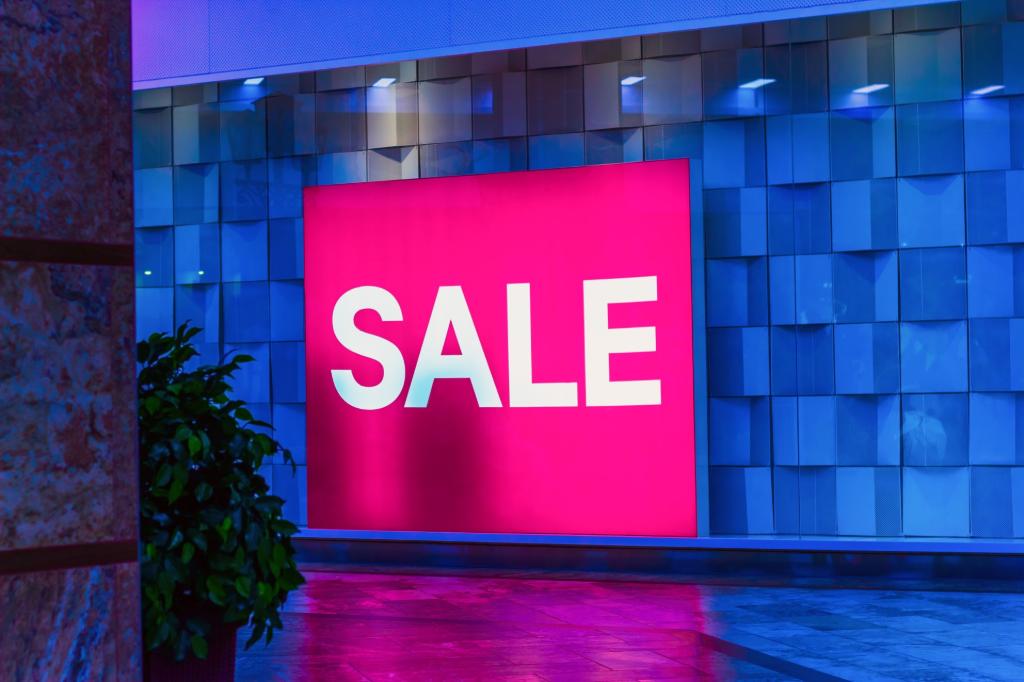
Have you ever walked past a giant red sale banner and felt an instant urge to step inside and see what they're offering? That wasn't just a great deal calling your name—it was color psychology doing its thing.
Using color well in large-format printing, such as banners, window graphics, and event signage, can shape your audience's thoughts and actions. But you may wonder: What is color psychology in marketing? How do you harness that power with purpose? How do you move from eye-catching to truly action-driving?
That's where strategy comes in, and this guide will show you how. We'll walk you through mastering color psychology in print marketing to create large visuals that captivate and convert.
Why Color Psychology Matters in Large Format Printing
Color is one of the most instinctive ways humans process information. It shapes first impressions and drives quick decisions about a product or environment, often without you realizing it.
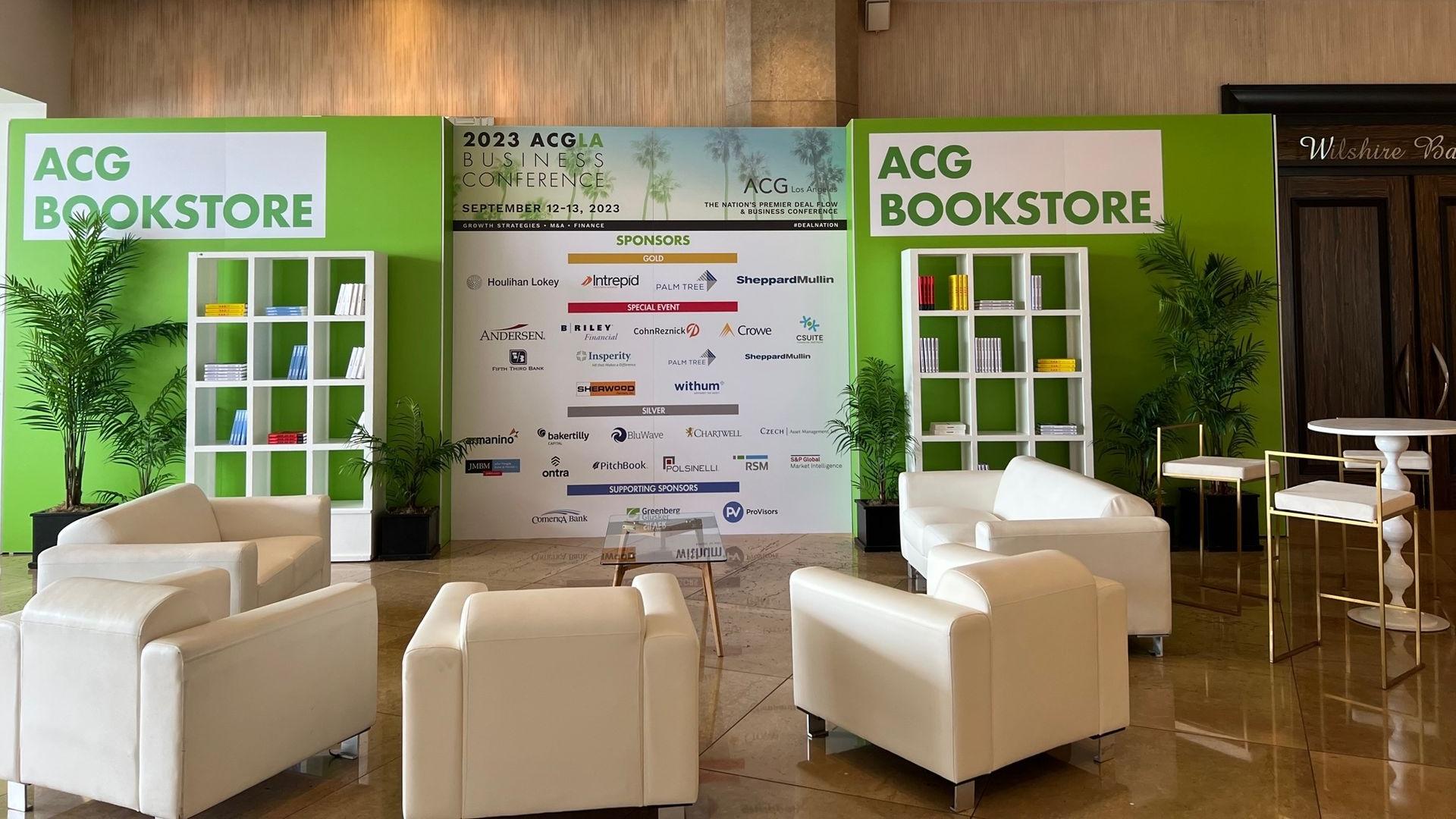
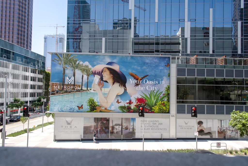
And when your signage is measured in feet, not inches, that impact multiplies. Large-format prints are big and bold to stand out, especially in high-traffic areas. Proper color marketing can draw someone in from across the room.
Just imagine a bright red banner screaming "SALE!" versus a calm blue one with the same message. Red evokes a sense of urgency and energy, pushing people to act now. Blue might feel more peaceful and less urgent. Both are valuable—it all depends on the emotional response you want to create.
The Emotional Impact of Colors: A Quick Breakdown
Not sure where to start? Here's a cheat sheet on the most common colors in print marketing strategies and how you can apply them to large-format printing.
Color | Emotional Impact | Best For |
Red | Urgency, excitement, appetite | Sales, food marketing, clearance signage |
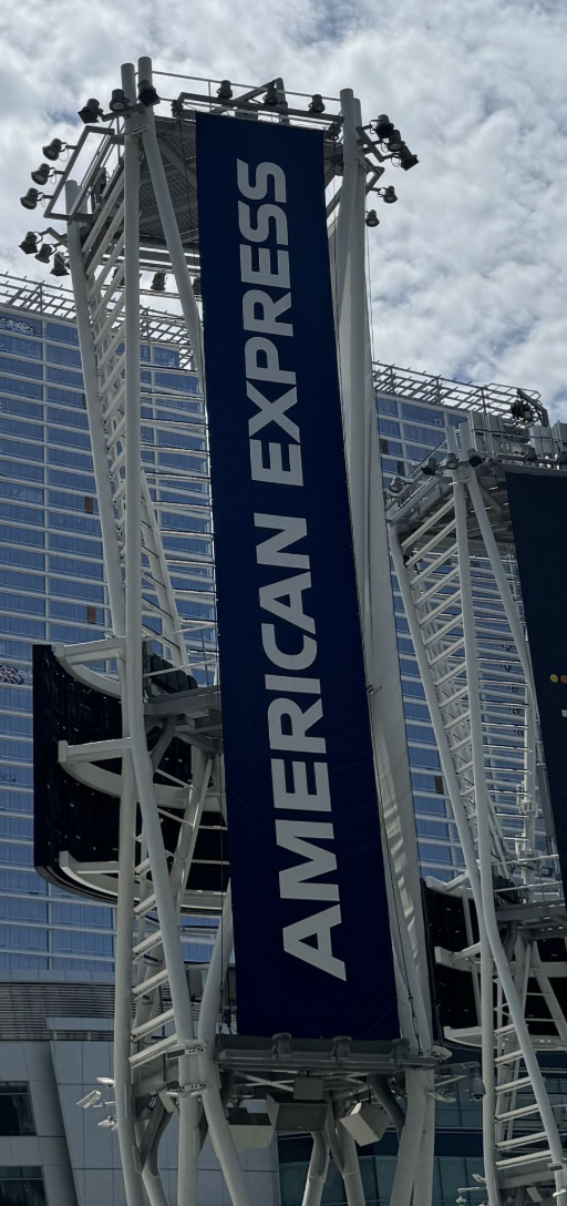
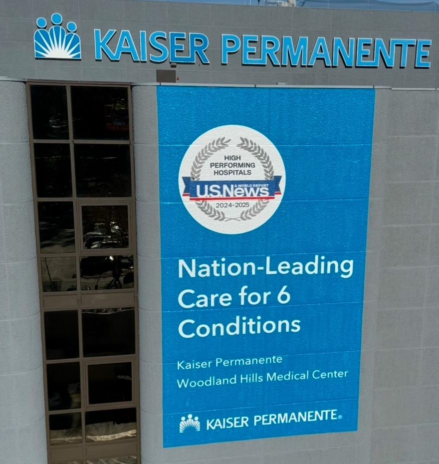
Blue | Trust, calm, professionalism | Finance, tech, healthcare, corporate signage |
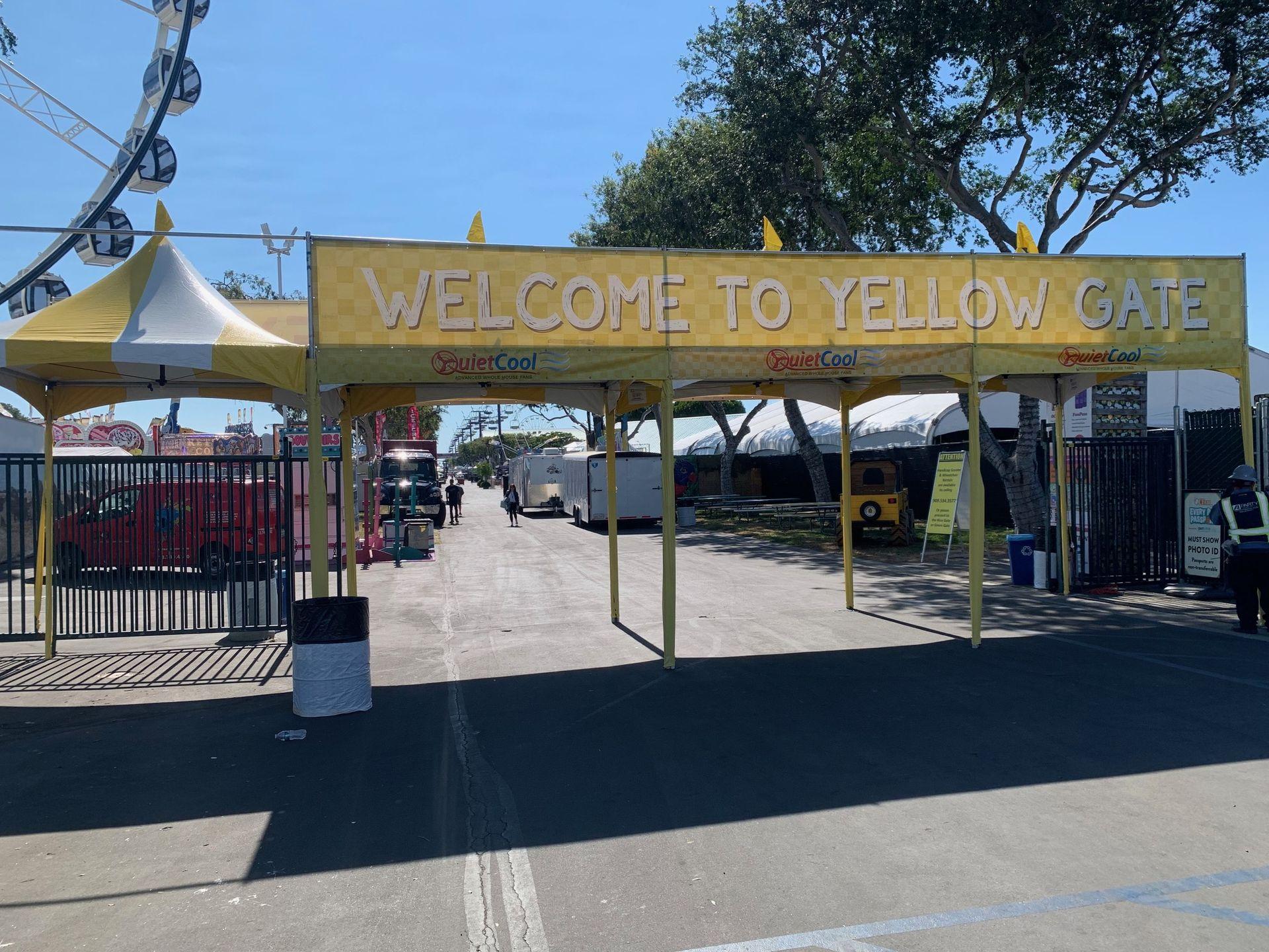
Yellow | Optimism, energy, warmth | Children's products, promotions, way-finding signs |
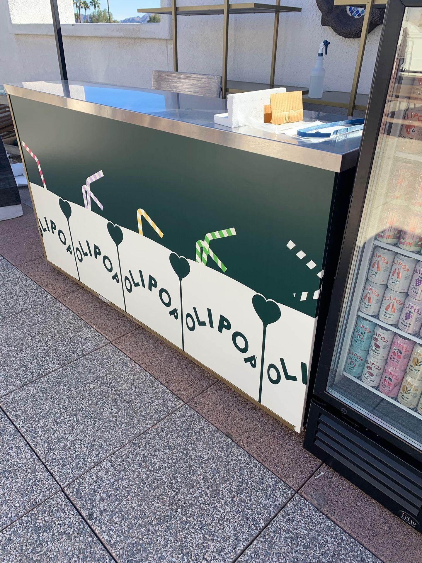
Green | Growth, nature, health | Wellness brands, eco-friendly initiatives |
Orange | Creativity, affordability, enthusiasm | Budget brands, event marketing, youth products |
Black | Sophistication, luxury, power | High-end retail, minimalist branding |
White | Cleanliness, simplicity, modernity | Modern brands, healthcare, product showcases |
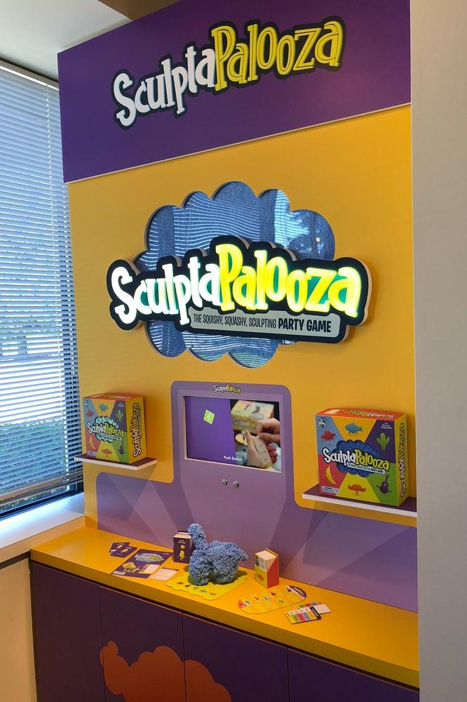
Purple | Spirituality, wisdom, creativity | Beauty, wellness, niche, or premium services |
1. Red
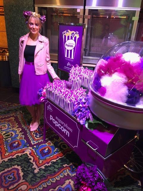
Red is bold, urgent, and impossible to ignore, which is why it's the go-to color for sale signs, clearance banners, and anything that needs to get people moving and acting fast. It can even trigger an appetite (think fast food).
Tip: Use red when you want to create excitement or drive action for promotions, grand openings, or limited-time offers. However, be careful not to make your sign too aggressive. Too much red can feel intense. You can balance it with softer tones to keep your visuals welcoming.

2. Blue
Blue has a calming, dependable quality. It's a favorite among banks, tech companies, and healthcare providers because it conveys stability and reliability, characteristics they want to be associated with.
Tip: Choose blue when you want your signage to feel stable and credible. Lighter blues feel relaxed and friendly, while darker blues lean more formal and authoritative. Blue works well for event graphics and service-based brands—you'll build trust before anyone even reads the text.
3. Yellow
Just like sunshine, yellow is all about positivity and energy. Depending on the saturation, it's visible from a distance and great for drawing the eye to your subject, especially in wayfinding signs or busy retail environments.
Tip: Use yellow to add warmth, fun, and friendliness to your visuals. It's great for promotions, children's events, or summer sales. You can pair yellow with cooler tones like navy or gray so it doesn't overwhelm the entire sign and make it look like a giant corn kernel.
4. Green
Green is fresh, natural, and versatile. It represents growth and wellness, making it a favorite for eco-conscious and health brands and groceries.
Tip: Try rich forest greens for grounding messages or sage tones for a contemporary feel. Think of welcome signage at outdoor events or eco-focused backdrops.
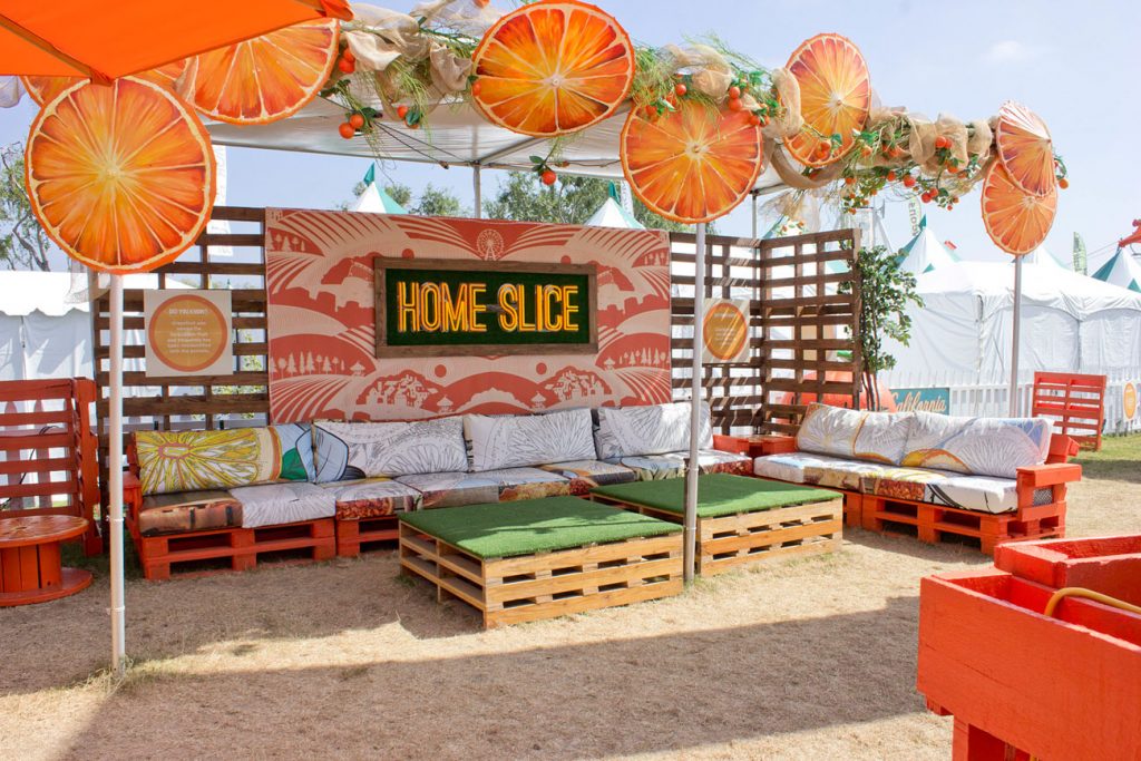
5. Orange
Orange combines red's energy with yellow's cheerfulness, evoking a sense of vibrancy and fun. It suggests creativity, affordability, or innovation.
Tip: Orange works great for events, youth campaigns, or pop-up experiences. You can use it when you want your sign to feel upbeat and approachable, but avoid using it too generously unless you're going for high energy.
6. Black
Black is sleek and sophisticated. It's the color of luxury, power, and minimalism—and it never goes out of style.
Tip: Choose black when you want to convey elegance or exclusivity. It works beautifully in high-end retail, tech, and fashion. For example, Chanel consistently uses black in its store signage and packaging to project timeless luxury. You can pair this color with white or metallics for extra impact and a polished finish.
7. White
White is the color of clarity and calm. It suggests a fresh start and gives your visuals plenty of breathing room.
More than just "blank" space, white space improves legibility and adds a modern, premium feel. Moreover, it guides the viewer's eye to what matters most. Intentional white space can make your message more straightforward, and your design feel more high-end.
Tip: Use white when you want your design to feel minimalistic or modern. It's also ideal for tech spaces or product launches where the focus is on cleanliness. You don't need to fill every inch of your print with design or color—sometimes, less is more.
8. Purple
Purple adds a touch of mystery and imagination. It's often linked to creativity, spirituality, and premium services, making it a hit in beauty and wellness.
Tip: Use purple to make your branding feel thoughtful or upscale. Deep purples pair well with gold for a luxe feel, while lavender evokes a calming effect.
Quick Recap
Bright, saturated tones tend to be more attention-grabbing, which makes them better for sale signs or street banners. On the other hand, muted tones feel elegant and thoughtful. They're great for lobby displays, corporate settings, or brand storytelling.
Remember, it's all about perception, so choose colors based on how you want your audience to feel about and view your sign.
How Color Perception Varies by Culture and Context
Color meanings aren't universal—they differ across cultures, countries, and places where you display your signage.
1. Cultural meanings can vary
While white symbolizes cleanliness in Western cultures, it signifies mourning and loss in parts of Asia. Red might also feel urgent or alarming in some countries and represent prosperity and celebration in others.
2. Know who you're designing for
If your business is based in a multicultural city, researching can help you connect with customers more effectively. Color choices that resonate in one community may feel off-putting or confusing in another.
3. Test, don't guess
Whenever possible, test your signage with people from different backgrounds. A quick round of feedback can catch unintended signals before you put out the sign live. You can also try working with professional designers who understand your local market or specialize in multicultural branding.
Pro Tip
When in doubt, don't rely on instinct—get insight. Consulting with someone who knows the area's culture can help you avoid mistakes and communicate effectively with colors.
Choosing the Right Color Combinations
A single color makes a statement, but a thoughtful palette can tell a whole story. Here's how to use color psychology in marketing in a more eye-catching, effective, and on-brand way.
1. Energize with complementary colors
Think blue and orange, red and green—colors on opposite ends of the wheel that spark serious contrast. Use them when you want instant impact, like on flash-sale banners or high-traffic event booths.
2. Stick with analogous colors for a cohesive look
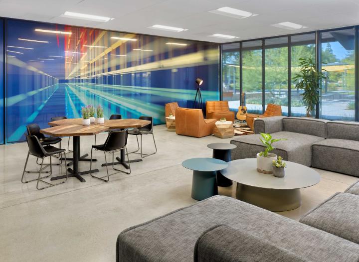
Go for analogous colors, like blues, teals, and greens, or reds, oranges, and golds. These neighborly hues work together like a good team, perfect for a clean, cohesive vibe for your signs in corporate interiors or branded displays.
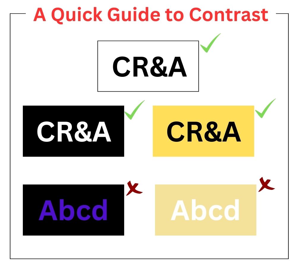
3. Prioritize high contrast for better readability
If you squint and can't read your sign from a few feet away, neither can your audience. So, consider using high-contrast colors, like white on navy or black on yellow, to make your message pop.
4. Use warm tones to draw attention
Red, orange, and yellow naturally stand out—they're perfect for calls to action, entrances, or anything that needs to grab attention fast. Human brains read these colors as bold and energetic, triggering a quick response.
5. Create a calming atmosphere with cool colors
Blues and greens are great for building trust and putting people at ease—think clinic check-in signs, spa menus, or bank info boards. Basically, anywhere you want things to feel calm.
6. Test your design at scale before printing
A layout that sings on your laptop might feel flat when blown up 10 feet wide. Always preview your design at scale—or in a mock-up—before printing to spot the difference between looking polished and off.
Paint the Town (and Your Print)
Color influences how people feel, think, and behave. When it comes to large-format printing, color's impact takes center stage—bold, bright, and impossible to ignore. Understanding the psychology of color in marketing lets you set the tone and drive action.
At CR&A Custom, we turn your ideas into visuals that hold attention. From trade show booths to storefront graphics, our large format printing services can help you make color choices that work as hard as you do and make your brand unforgettable. Let's bring your next big visual to life.
Schedule a consultation today to learn more about our offerings.