When a global brand like Tinder hosts a high-visibility event, every detail in the room becomes part of the story. Guests take photos, influencers post, and the media captures tight shots and wide angles. The floral installations and dimensional logos become the backdrop to the brand itself.
Our CR&A Custom team recently produced and fabricated a large format print and dimensional branding package for Tinder. At first glance, it looks effortless. The display had a white Tinder logo floating over a dense wall of pink and white florals, including a clean plexiglass tabletop sign. The sign had crisp white lettering with soft tones in an elegant setting. This project was anything but simple.
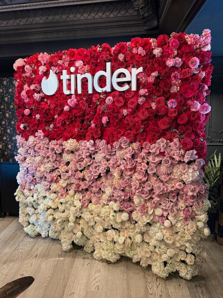
The Floral Wall: Precision Behind the Romance
The floral wall featured an ombré blend of deep rose, blush, and white blooms. Centered within the installation was the Tinder logo in dimensional white lettering. To most viewers, it appears that the letters are simply mounted on top of flowers. That illusion requires precise engineering. This precision comes from 32-plus years of experience in producing large format print environments for high-profile brand activations.
Before fabrication begins, our team builds a precise template that defines exact logo scale, spacing, and mounting depth. The template ensures the letters align perfectly across the surface, even when that surface is organic and uneven like a live floral wall. Flowers shift, petals compress, and density varies. Without a rigid placement guide, the logo can easily look crooked or sink visually into the background.
We created a custom mounting template that allowed the installation team to position the letters accurately while preserving the integrity of the florals. Each letter was fabricated with proper depth and structural support so it would not disappear into the flowers. The spacing had to account for sightlines from multiple camera angles. A step to the left or right during installation changes how shadows fall across white letters against pink blooms.
In an activation like this, you only get one chance. Once the florals are installed and the press arrives, there are no do-overs.

Dimensional Letters: Clean, Bold, and Camera-Ready
The Tinder logo letters were produced in crisp white with smooth, flawless faces. White sounds easy, but it isn't. Under event lighting, white can reveal imperfections quickly. Surface quality matters. Edge finishing matters. Even subtle inconsistencies become visible in high-resolution photography.
Each letter was precision cut, routed, and finished to ensure clean edges and consistent thickness. Mounting hardware was concealed so the logo appears to float seamlessly over the floral backdrop. The result is a brand mark that feels light, modern, and unmistakably Tinder.
The Plexiglass Table Sign: Subtle Engineering
The tabletop signage may look minimal, but it required just as much attention.
The sign consists of a clear acrylic base with dimensional white Tinder lettering mounted on top. What makes it pop visually is the contrast. The base is fully transparent. The letters are solid white. When placed on a dark marble surface, the clear acrylic almost disappears, allowing the white letters to feel suspended in space.
To achieve that effect, the acrylic edges must be polished perfectly. Any cloudiness or tool marks would distract from the illusion. The white letters were fabricated to sit flush and balanced, with secure mounting that remains invisible to the viewer.
Scale also plays a role. The sign had to be large enough to register in photos, yet refined enough to feel elegant in a luxury setting. Too thick and it becomes bulky. Too thin and it loses presence. That balance comes from experience.
Brand Activations Are Engineering Projects
High-profile environments demand foresight. Lighting conditions vary. Surfaces reflect. Camera flashes amplify flaws. The installation must be stable, safe, and visually flawless.
Projects like this are never just about cutting letters. They require templates, structural planning, material selection, finishing discipline, and coordinated installation. When done correctly, the work fades into the background and the brand takes center stage. That’s the goal.
Tinder’s activation space felt polished and effortless. Guests saw a beautiful floral wall and a clean white logo. What they did not see was the engineering, fabrication precision, and installation expertise behind it.
That unseen work is where CR&A Custom shines. Give us a call to learn how we can help your next brand activation be as precise and perfect as it should be.