Signage works like a quiet ambassador for your business. People see it before they talk to your team, step inside your space, or interact with your brand. Clear typography shapes that first impression. The right mix of font choice, size, spacing, and color guides the eye fast and delivers meaning without confusion. When you use typography with intention, your signs read well from any distance and strengthen your brand identity through style that feels consistent and recognizable.
This visual guide introduces practical ways to use typography that supports both clarity and design. You’ll see how thoughtful choices are when you create signage that communicates your message instantly while keeping your brand’s personality visible.
Typography in Signage: How to Make Messages Clear and Design for Style and Function
Typography shapes how people experience your signs before they even enter your business. The right fonts, sizes, spacing, and colors make messages clear and guide the viewer’s eye instantly. Thoughtful typography ensures your signs are readable, professional, and aligned with your brand identity.
7 Tips for Typography in Signage
Typography is crucial for signage because it determines how quickly and effectively your message is communicated. Follow these seven practical tips to ensure your signs are clear, visually appealing, and strongly represent your brand.
1. Understand Your Audience
Pick fonts that suit your audience and environment. Think about where people will see the sign. For instance, a mall banner uses bold, fun fonts to attract shoppers, while a corporate lobby sign favors serif fonts for authority.
2. Prioritize Readability
Keep text short, spaced well, and easy to scan. Avoid overly decorative fonts for main messages. In practice, a café menu board with three to four words per line reads faster than paragraphs. Test signage at actual viewing distances, ensuring readability in crowded areas.
3. Select Fonts That Reflect Your Brand
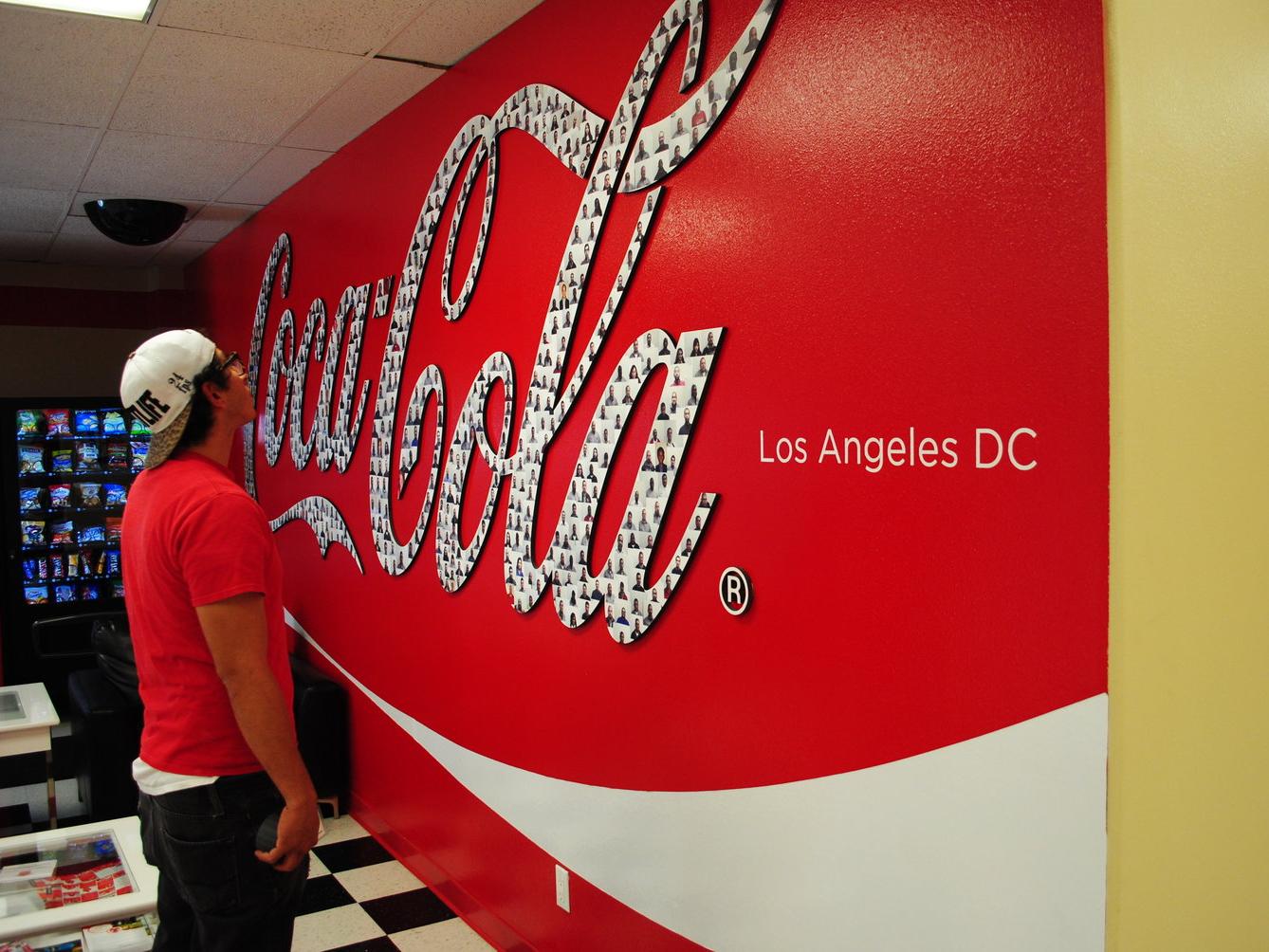
Limit signage to 2–3 consistent fonts. Keep styles aligned across banners, wall graphics, and window displays. Luxury retailers, for example, use clean minimalist fonts for elegance, while playful brands might mix a display font with a neutral sans-serif.
4. Optimize Size and Hierarchy
Headlines should be large; supporting text smaller. Use hierarchy to guide attention naturally. A storefront sign should place a bold headline at eye level with more minor details below, improving readability from the street while keeping the design balanced.
5. Ensure High Contrast for Visibility
For optimal legibility, adequate signage needs high color contrast (e.g., white on dark, or black on bright yellow/white). To ensure clarity despite environmental factors like lighting, glare, and reflections, signs should use anti-glare/matte finishes, strategic angling, and bold, high-opacity lettering, especially on glass.
6. Blend Style and Function
Signage typography requires clear legibility for fast, distant communication, prioritizing it over creative expression. Balance unique brand typefaces with readable fonts, high contrast, and appropriate size. Use creative elements only for composition and non-critical details.
7. Work With Professional Signage Experts
Successful, durable signage depends on precise installation, resilient materials, and correct scaling. These ensure safety, visibility, code adherence, and minimize maintenance by optimizing readability and preventing degradation.
Why Typography in Signage Works
Effective typography does more than make signs look good—it directly impacts how quickly people understand messages and how they perceive your brand. These key benefits explain why thoughtful type choices are essential for any signage project.
Instant Communication
Typography delivers messages in seconds, which is critical in high-traffic areas where viewers don’t stop for long. Clear fonts and proper spacing help people absorb key information immediately.
Brand Reinforcement
Consistent fonts, styles, and hierarchy build recognition across all signage. Repeated use of typefaces reinforces brand identity and fosters trust. For example, corporate office signage that maintains the same serif font across lobby, wall graphics, and conference room labels creates a cohesive, professional appearance.

Versatility
Good typography works across banners, retail displays, and event graphics without losing clarity. Seasonal campaigns, temporary promotions, or permanent signage all benefit from types that adapt visually while remaining readable.
Improved Readability
Clear text ensures viewers understand messages quickly, even from a distance. Proper kerning, leading, and font size reduce visual strain and make signs accessible to a wider audience. Wayfinding signs, menus, and promotional banners all perform better when readability is prioritized.
Visual Appeal
Well-chosen typefaces enhance the overall design and draw attention without cluttering the message. Typography can complement graphics, textures, and colors to make signs both attractive and functional. Signage designed with visual balance keeps viewers engaged while reinforcing brand style.
Creative Typography Ideas That Capture Attention
Using creative typography can make your signage memorable while keeping messages clear. These ideas show how to add visual interest without sacrificing readability.
Layered Fonts
Combine serif and sans-serif fonts for contrast and emphasis. Layering can highlight essential words or sections. Retail storefronts often use this technique to make sale announcements stand out.
Textured Letters
Incorporate materials like vinyl, metallic foils, or raised lettering. Textures add a tactile dimension that draws viewers’ attention. Premium spaces, like hotel lobbies or luxury boutiques, often use textured signage to reinforce brand quality.
Dynamic Layouts
Use angled, curved, or 3D typography to guide the eye. Motion and dimension create visual interest and encourage viewers to explore the sign. Event graphics and promotional displays benefit most from dynamic layouts.
Illuminated Typography
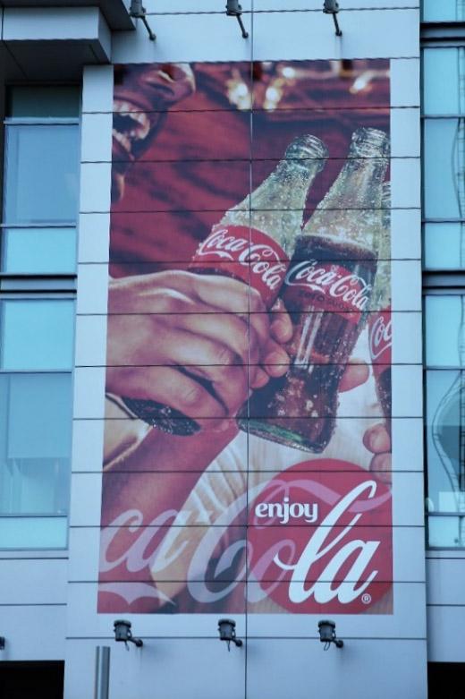
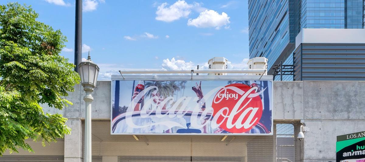
Add backlighting, neon, or LED elements. Lighted type boosts visibility at night and adds a dramatic effect. This works well for exterior signs, restaurant marquees, and entertainment venues.
Interactive Text
Pair type with QR codes, AR elements, or motion-triggered visuals. Interactivity draws engagement and makes the signage experience memorable. Trade shows and experiential marketing activations often use interactive typography to increase dwell time.
Bold Color Contrasts
Use complementary or high-contrast colors to make text pop. Bold color schemes improve legibility and immediately draw attention. Outdoor signs and point-of-sale displays benefit from strong contrasts.
Typographic Hierarchy
Highlight keywords using size, weight, or style variations. Hierarchy ensures the viewer knows what to read first. Storefronts, menus, and promotional signs all rely on hierarchy to communicate effectively in seconds.
Making Every Letter Count
Effective typography transforms signage into a powerful communication tool. Clear fonts, thoughtful hierarchy, and high-contrast colors make messages readable at a glance and guide viewers’ attention where it matters most. Creative type treatments can add personality without sacrificing clarity, ensuring signs both inform and engage.
For businesses looking to elevate their visual presence, partnering with a trusted large-format printing company ensures your signs are designed, produced, and installed with precision. CR&A Custom combines expertise in typography, durable materials, and professional installation to deliver signage that performs across environments—from retail displays to event activations.
Explore our large-format printing services to see how your brand can make an impact. Visit CR&A Custom to get started.
Carmen Rad
FAQs
Typography in signage is the choice and arrangement of fonts, sizes, and spacing on a sign. It ensures messages are readable, visually appealing, and aligned with your brand.
Clear fonts, proper spacing, and hierarchy make it easy for viewers to read and understand messages quickly. Poor typography can confuse or slow down communication.
Simple, legible fonts are ideal for main messages. Limit to 2–3 font styles, using sans-serif for modern readability and serif for a more formal look.
High contrast between text and background improves legibility from a distance. It ensures messages remain visible under different lighting and environmental conditions.
Yes. Professionals handle font selection, scaling, and installation. Their expertise ensures your signage is readable, durable, and visually aligned with your brand.